Websites that create clarity
The two example projects below show how I design websites: clear, user-friendly, and crafted with attention to detail. They serve as a reference, not a prescription. Every client project is created individually so it truly fits you.
Not a sales call. We clarify your goals and obstacles. You leave with concrete recommendations.
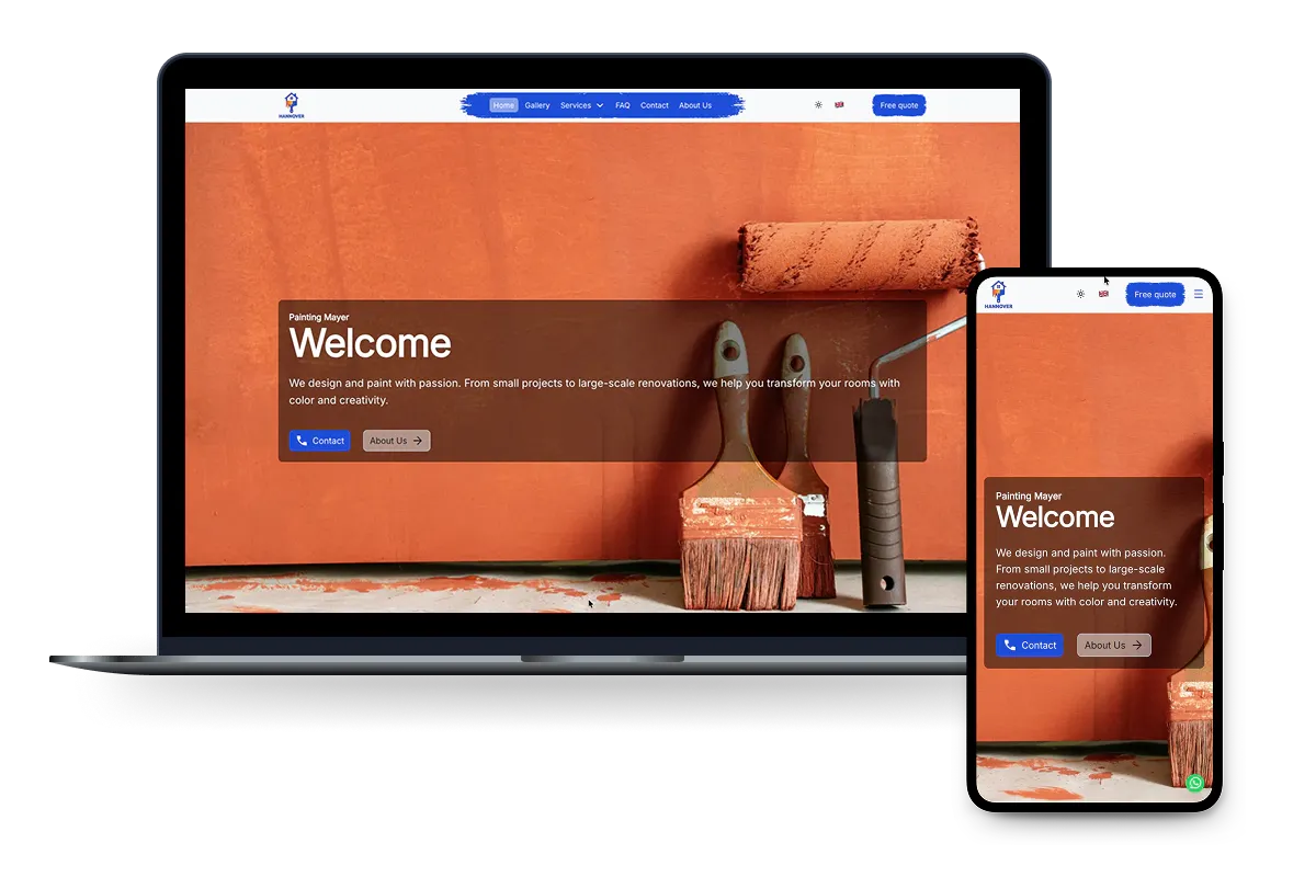
Painting Contractor
How can a small craft brand present itself so that quality and personality are obvious at a glance? The goal is a lively site that still guides users clearly and makes inquiries effortless.
Challenges
Starting point. Lots of images. An unclear hero section. Visitors don’t see the quality at first glance.
Goal. Build trust quickly. Make the work tangible right away. Provide effortless orientation.
Results
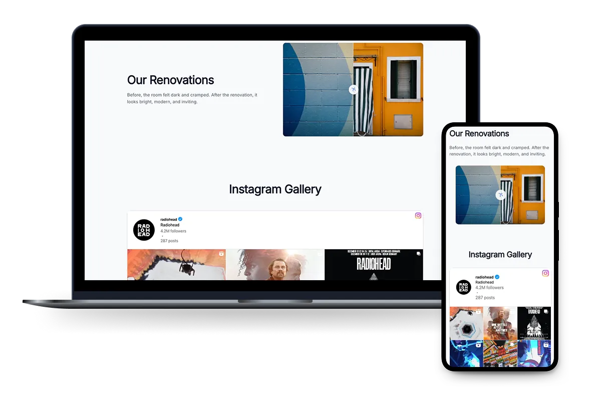
What improves for visitors. A large, lightweight hero image sets the scene immediately. A before/after slider shows the difference at a glance. A filterable gallery makes browsing easy. An Instagram tile highlights recent work as a visual cue.
What that means for you. More clarity. A shorter path to inquiry. Fewer distractions from tech. Content can be maintained without extra steps.
Insights
- Fast images. Fast site. Images are delivered in sizes that match the screen. That shortens load times and keeps visuals crisp.
- Prioritize what matters. Above-the-fold assets load first. Everything else follows on demand. This feels noticeably faster on mobile.
- Accessible before/after. The slider is accessible. It works with the keyboard too. The feature remains usable for everyone.
- Filterable gallery. Many projects stay organized. Visitors find relevant examples faster.
- Fresh work as a prompt. The Instagram tile showcases recent work and invites contact.
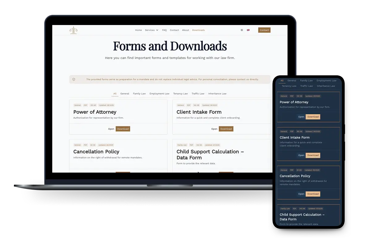
Law Firm
How can a firm convey calm and competence while making documents easy to find? The goal is orientation without distraction and a fast path to the client’s need.
Challenges
Starting point. Lots of information. Clients don’t know where to begin.
Goal. A credible, composed presence. Clear structure. Simple paths to documents and contact.
Results
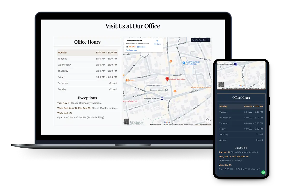
What improves for visitors. A calm, highly readable layout guides them step by step. A downloads section with clear file names and filters saves search time. Opening hours and directions are immediately visible. Phone, email, and the form are clearly placed. Quick access to common requests.
What that means for you. Fewer follow-up questions. Faster preparation for meetings. A reliable impression on new clients.
Insights
- Simple. Secure. Built-in form protection instead of extra third parties. That protects privacy and keeps the flow lean.
- Find, don’t search. Clear file names and filters guide clients to the right documents quickly.
- Contact front and center. Phone, email and the form are clearly placed. The next step feels easy.
- Readability. Calm typography and generous spacing create orientation and a credible overall look.
Your website is taking up too much of your time.
Let’s talk: 30 minutes, clear next steps, and no sales pitch. I’ll explain what I take care of and what you need to provide.
Appointment usually within 2 business days.